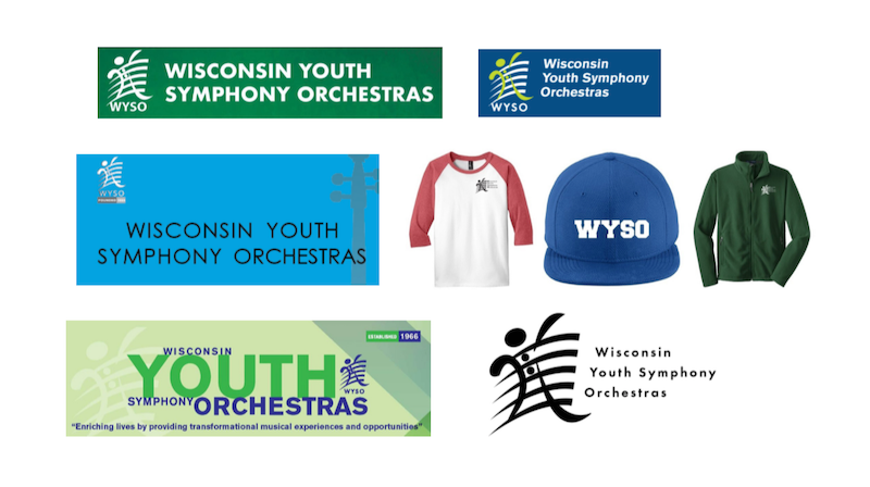
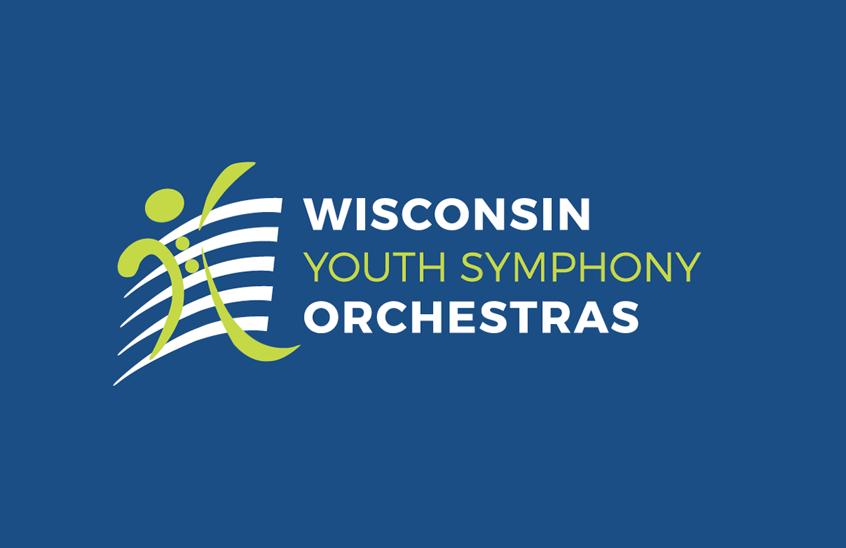
The Wisconsin Youth Symphony Orchestras hired me to refresh their branding. We started with their logo - simplifying the typography alongside their brand mark, which they wanted to keep as-is. They also wanted to maintain their historical blue and green colors, but I suggested adding additional colors to really bring some fun to their brand materials. WYSO is an organization for kids, so having a fun brand helped them to engage their audience better!
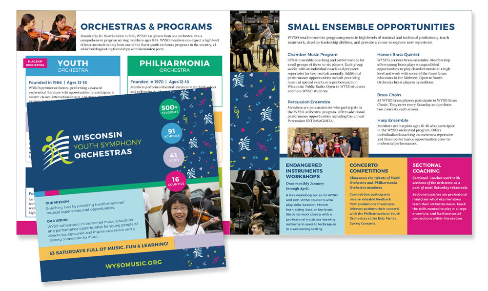
DESIGN FOR PRINTED BROCHURE HIGHLIGHTING PROGRAMS & OPPORTUNITIES
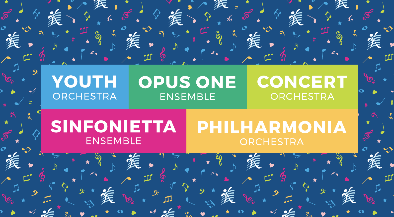
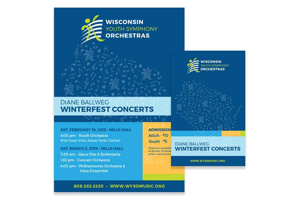
CONCEPTUAL DESIGN FOR CONCERT MATERIALS
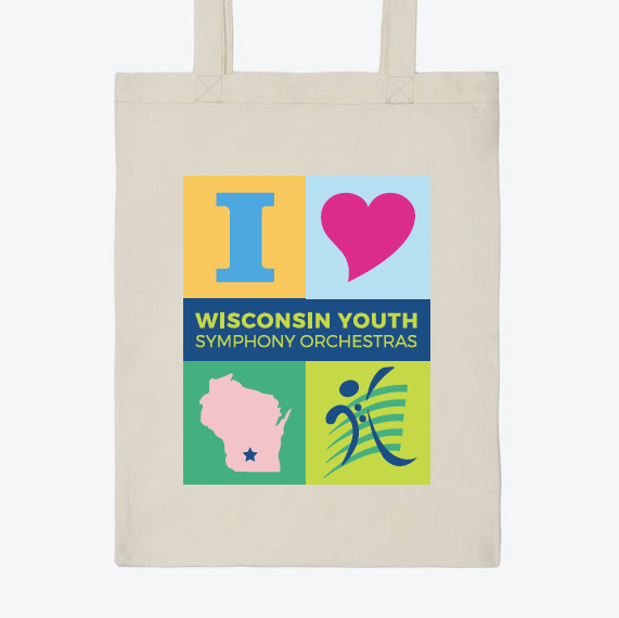
HAVING FUN WITH COLORS & ICONS

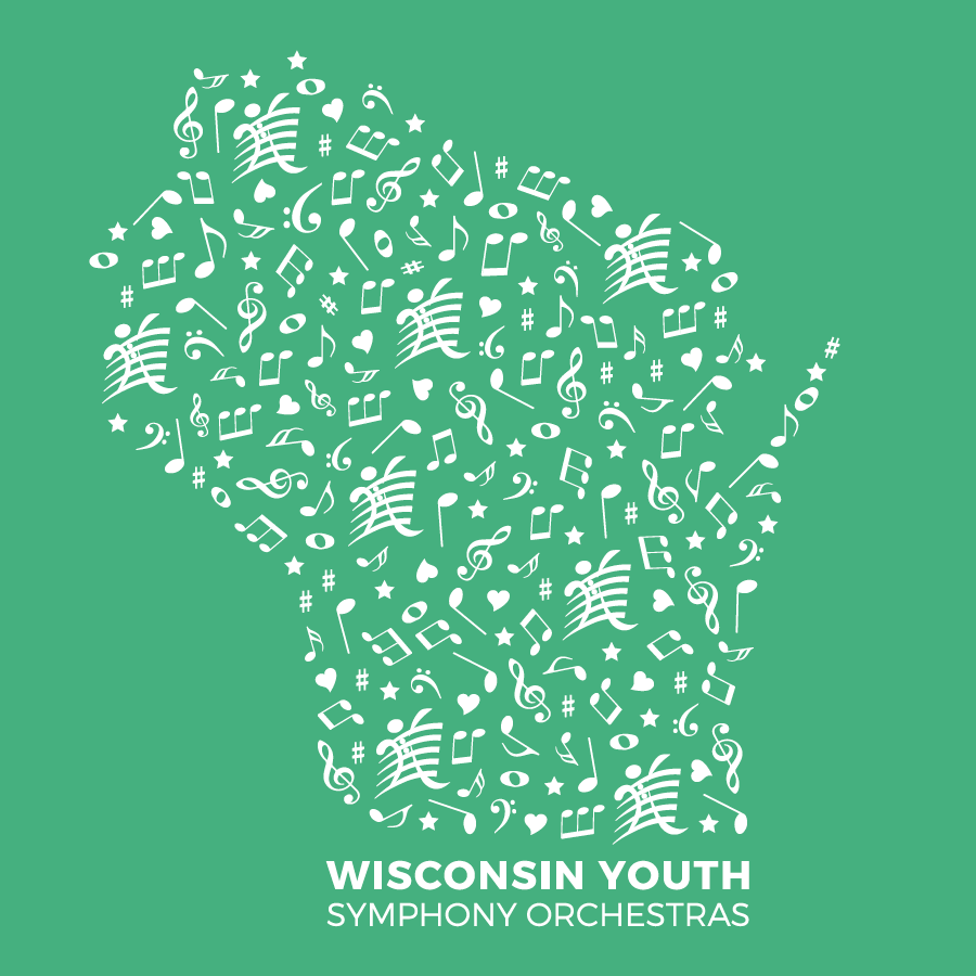
VARIOUS VERSIONS OF THE LOGO USED ON PREVIOUS ASSETS & MERCHANDISE